
Steam Access
Designing a Platform-Level Accessibility System for Steam
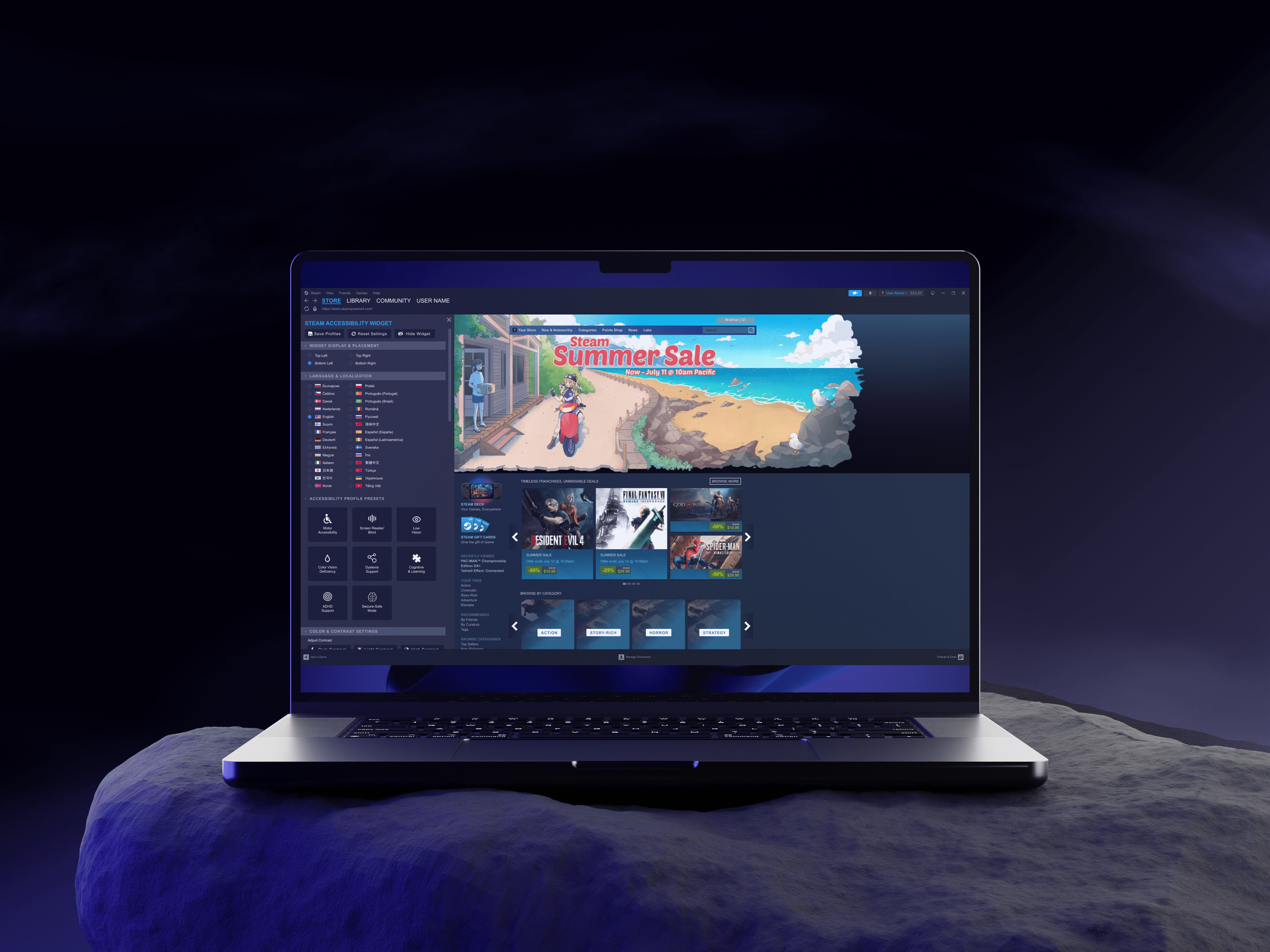
Steam Access introduces a centralized accessibility system embedded directly into the Steam desktop experience. Players can preview accessibility features, customize visual settings, and evaluate accessibility support before purchasing games.
Role • Sole UX Researcher & UX Designer
Timeline •65 Hours
Platform •Desktop (Steam Client & Web)
Tools •Figma · Adobe Creative Cloud
The Problem
Steam is one of the largest PC gaming platforms in the world, yet accessibility support is fragmented across individual games. Players often rely on trial-and-error, community forums, or third-party tools to determine whether a game includes the accessibility features they need before purchasing.
Unlike console ecosystems that offer system-level accessibility settings, Steam lacks centralized tools such as color vision filters, scalable interface settings, and accessibility discovery filters.
As a result, players with visual impairments—or those experiencing temporary visual strain—face unnecessary friction when browsing the store. Accessibility becomes a game-by-game uncertainty rather than a platform capability.
Discover accessibility features before purchase
Customize visual settings at the platform level
Save and reuse accessibility preferences
Improve accessibility transparency across games
The Opportunity
Steam Access introduces a centralized accessibility system embedded directly into the Steam platform.
The concept focuses on making accessibility easier to discover, preview, and customize across the platform. Steam Access enables players to:
Discover accessibility features before purchase
Customize visual settings at the platform level
Save and reuse accessibility preferences
Improve accessibility transparency across games
By integrating accessibility discovery and platform-level tools into the Steam experience, players can evaluate whether a game meets their needs before purchasing or launching it.
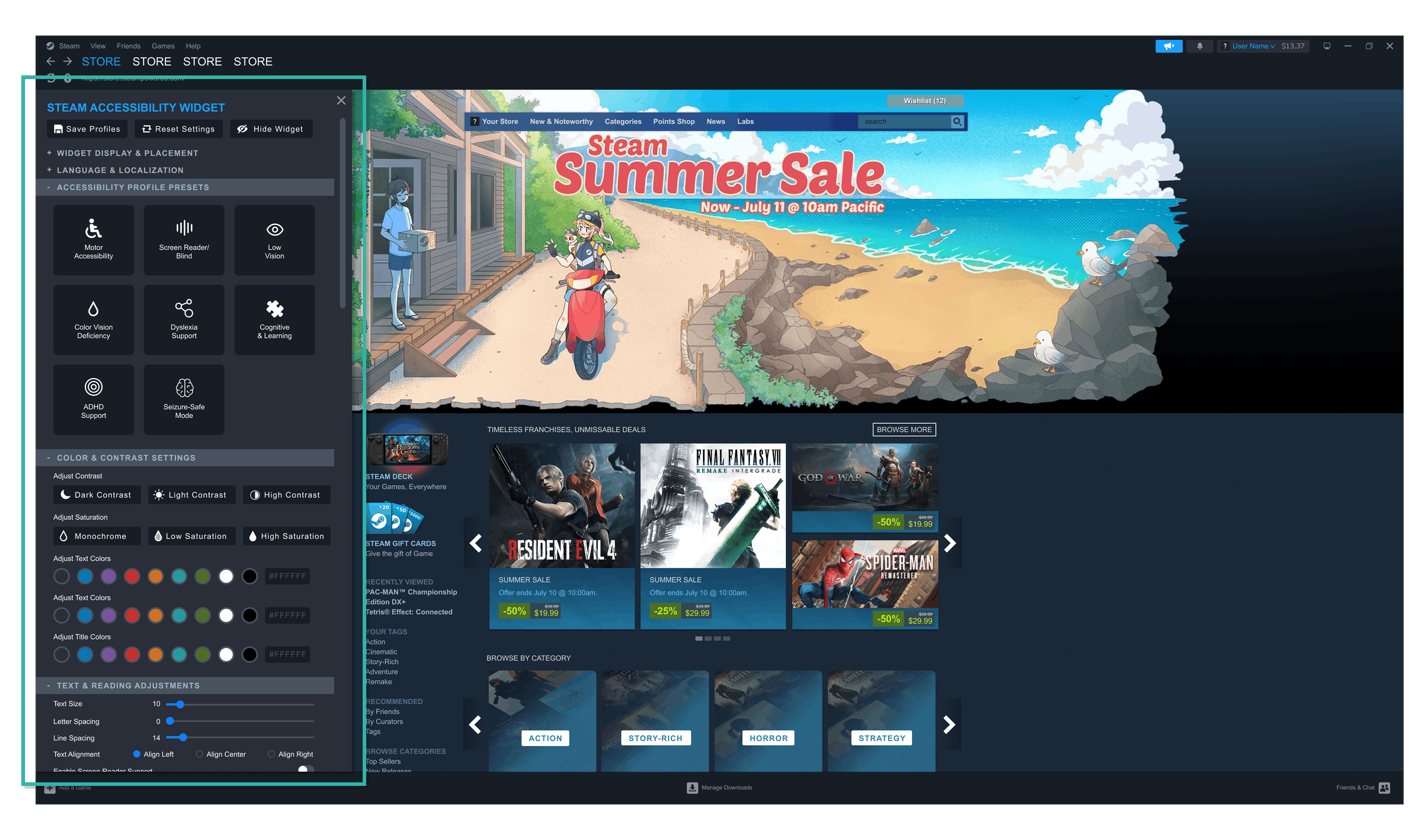
High Fidelity Preview: Steam Access integrates platform-wide accessibility controls directly into the Steam desktop experience.
Research
To understand accessibility challenges across gaming ecosystems, I combined competitive analysis with user interviews.
The research focused on how players discover accessibility features, evaluate games before purchasing, and adjust visual settings while browsing Steam.
Competitive Landscape
I analyzed major gaming platforms across three dimensions:
System-level accessibility controls
Accessibility discovery within the store
Consistency across games
Console ecosystems centralize accessibility tools, while PC storefronts rely heavily on individual game implementation.
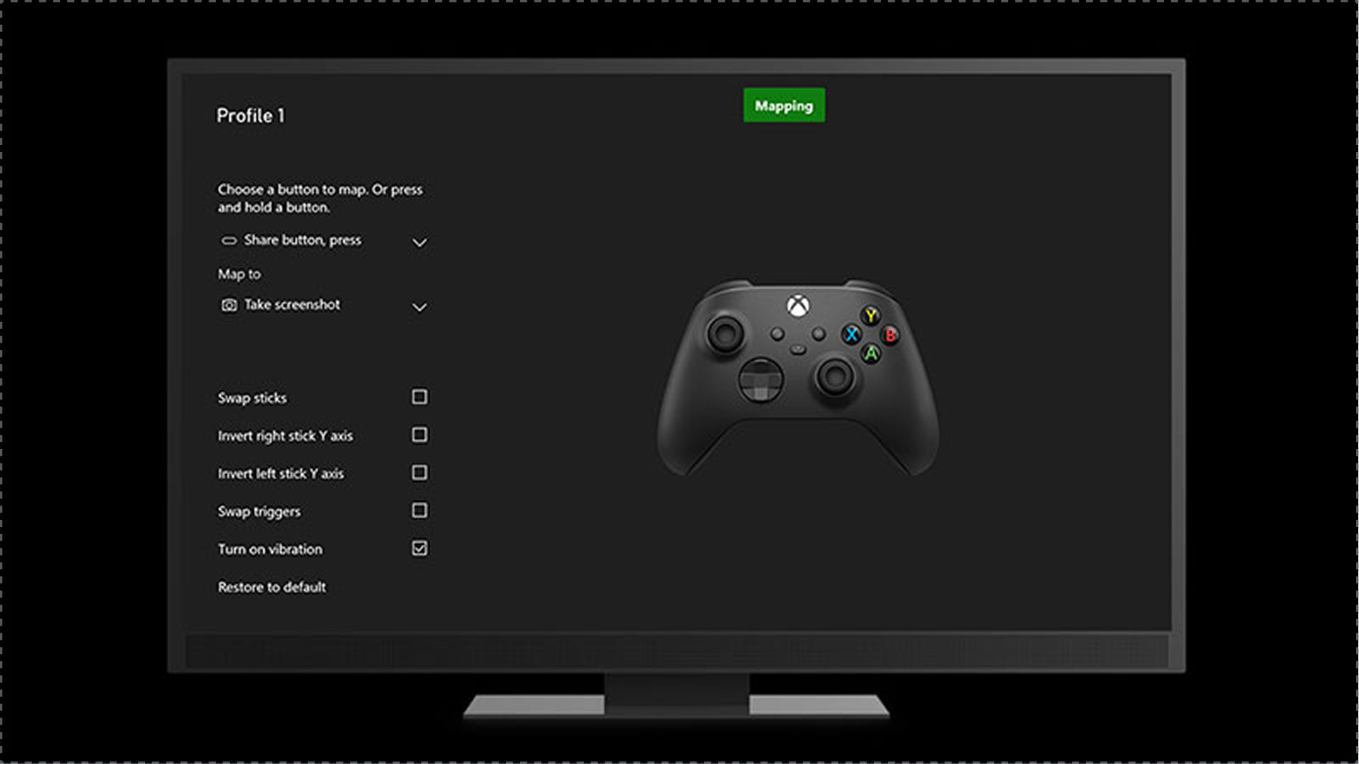
Xbox
✅ System-wide accessibility settings across the platform
✅ Strong adaptive controller support and input remapping
✅ Clear accessibility tags in the game store
❌ Accessibility features still vary by game
❌ Setup can feel complex for new users
❌ Adaptive hardware can be costly
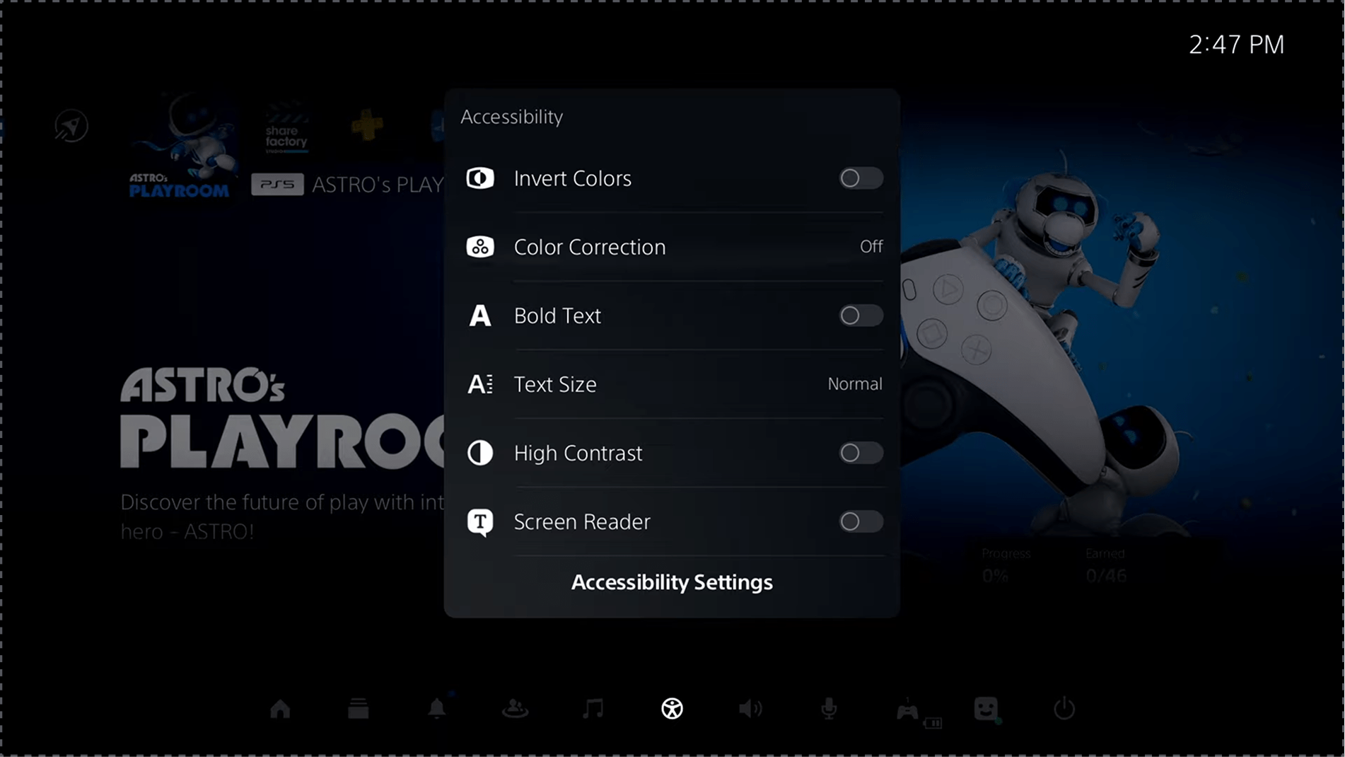
Playstation
✅ Comprehensive system-level visual and input accessibility settings
✅ Dedicated accessibility controller for physical needs
✅ Built-in text-to-speech and display customization
❌ Accessibility tags are limited in the game store
❌ Features are not consistently implemented across games
❌ Proprietary hardware limits flexibility
Epic Games Store
✅ Popular titles with some in-game accessibility options
❌ No platform-wide accessibility settings
❌ Lacks accessibility filters or tags in the store
❌ Heavy reliance on individual games for accessibility support
Key Insights
Console platforms centralize accessibility controls at the system level, allowing players to configure accessibility settings before launching games.
PC storefronts rely on individual game implementation, creating fragmented accessibility experiences and uncertainty during game discovery.
This gap highlights an opportunity for platform-level accessibility within Steam.
User Insights
Five gamers aged 26–43 participated in interviews, including players with visual impairments, motor limitations, temporary injuries, and accessibility advocates.
The interviews explored how players evaluate accessibility when browsing Steam and where they encounter friction in the interface.
Key Insights
Discoverability
Players struggled to determine whether games supported accessibility features before purchasing.
Design Impact
→ Introduced a centralized Accessibility Widget.
“It's hard to tell if a game even has the accessibility settings I need.”
— Alex D.
“A lot of the accessibility options feel buried or inconsistent between games.”
— Alex D.
Color & Contrast
Participants with color vision deficiencies had difficulty distinguishing sale indicators and UI elements.
Design Impact
→ Implemented Tritanopia-focused color filters and contrast previews.
“The sale text is hard to see. Sometimes I miss important info.”
— Alex D.
“Even something simple like a colorblind mode tag would go a long way.”
— Devin K.
Visual Fatigue
Players described Steam’s interface as dense and visually overwhelming.
Design Impact
→ Simplified hierarchy and improved contrast clarity.
“The menus just feel dense sometimes. I get lost trying to adjust anything.”
— Samira L.
“Even as someone without a disability. The interface can feel overwhelming when I’m tired.”
— Devin K.
Design Focus
Three personas were developed to represent a range of accessibility needs across Steam. While each informed the broader problem space, the vision-supportive gamer most directly guided design decisions.
Jordan
Vision-Supportive Gamer
AGE 38
GENDER MALE
STATUS SINGLE

Primary Need
Improved color contrast and text readability to navigate Steam independently
Key Goal
Browse the store and evaluate games without eye strain or external tools
Top Frustration
Low Contrast UI elements and no platform-level color vision support make key information hard to see.
Design Focus
Platform-level color vision presets, clearer contrast for pricing and labels, and quick access to visual settings
Design Principles
Insights from research informed three principles that guided the design of Steam Access.
Accessibility by Default
Accessibility controls should be easy to discover and configure at the platform level.
Clarity Over Complexity
Visual adjustments should improve readability without introducing unnecessary interface complexity.
Confidence Before Purchase
Players should be able to evaluate accessibility support before buying a game.
Information Architecture
A player with Tritanopia struggles to distinguish blue and green interface elements—especially sale labels—while browsing Steam. This flow illustrates how players discover accessibility settings, preview color filters, and apply visual adjustments.

Accessibility configuration flow showing how players discover and apply visual adjustments within Steam.
Design Exploration
Early wireframes explored how an accessibility widget could integrate into Steam’s browsing interface without disrupting familiar navigation patterns.

Mid-fidelity wireframes exploring the Accessibility Widget interface and its integration within the Steam homepage, showing the full settings panel alongside the entry point and expanded widget state.
Final Design
High-fidelity designs refined the widget interface and surrounding Steam UI, focusing on clarity, hierarchy, and discoverability.


Color Vision Accessibility
Preview of the Steam interface as experienced by players with Tritanopia, followed by the adjusted configuration designed to improve contrast and readability.


Iterations
Usability testing revealed opportunities to improve clarity, customization, and confirmation states within the accessibility widget.

Interactive Prototype
The prototype demonstrates how players can discover accessibility settings, preview color filters, and apply visual adjustments directly within the Steam interface.

Impact
Usability testing showed strong task completion and user confidence when configuring accessibility settings.
100%
Of players completed core tasks successfully.
4.1 / 5
Average satisfaction rating.
Reflection
Accessibility should be designed at the platform level, not added game by game.
Flexibility must be balanced with simplicity to avoid cognitive overload.
Future iterations could expand accessibility support for motor and cognitive needs.