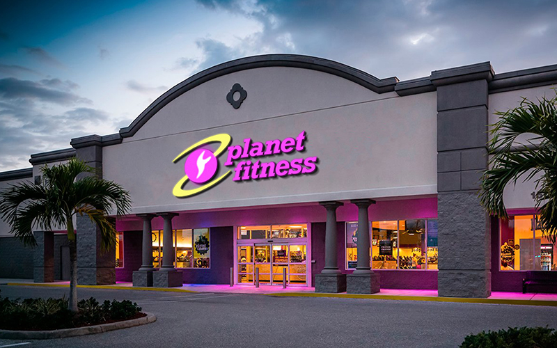
Planet Fitness
CONCEPT | IDENTITY | COLLATERAL | PACKAGING
Planet Fitness is a franchise that provides an affordable workout environment where members can build a lasting, active, and healthy lifestyle. Rather than competing with other more upscale gyms, Planet Fitness owes its success to focusing on people who aren't used to working out and just getting started exercising. Although Planet Fitness has a clear marketing strategy, its brand image does not reflect this.
As a result, I created a more friendly and relatable conceptual rebrand of Planet Fitness. I took some inspiration from successful corporate brands that specialize in fitness apparel, such as Nike, Addidas, and Reebok, to create a monogram that is simple but memorable. The monogram uses the letters P and F to resemble the planet Saturn and its rings. In ancient Roman mythology, Saturn dethrones his father, Uranus. Saturn symbolizes the changing of an old regime and the death of the old and rebirth of the new. Planet Fitness members seek to change their daily lifestyles in favor of a healthy one.